Even if you have amazing content in your CV, it could still be overlooked by employers if the format isn’t up to scratch.
Your CV format is how the information is arranged and presented on the page (think layout, colour-scheme, font etc.) – so it plays a big part in getting recruiters to notice and understand your CV.
I’ve compiled the 4 best CV formats that are helping job seekers to get hired in today’s job market below, along with a simple guide on how to format your own CV for best results.

These are the 4 most popular and effective CV formats being used in the job market today.
Below we’ll take a closer look at the features and advantages of each one.
Traditional CV format
If you’re looking for a CV that has broad appeal and a timeless professional appearance, opt for a traditional CV format.
It’s simple but effective, with slim borders separating each section of the CV – allowing recruiters to easily navigate the page and digest the content.
It’s also a no-fuss design that can easily be recreated if you want to write your CV from scratch using a Word processor like Word or Google Docs.
Best for: Applying to traditional companies like banks and consultancies.
Modern CV format
When you trying to stand out from the crowd in today’s competitive job market, then opting for a modern CV format is the way forward – especially when applying with forward-thinking employers.
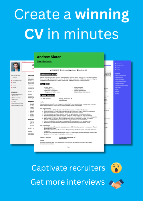
The modern CV format has a bold colour bar at the top of the first page, that hosts your name and professional title – really making them pop and grab the attention of busy recruiters.
The sections on the CV (such as the profile, work experience etc.) are nicely separated by cool looking boxed headings, and plenty of white space – creating a contemporary look, and giving hiring managers a seamless reading experience.
Best for: Applying to tech and digital roles
2 Column CV format
If you’re looking for a blend of style and functionality, a 2 column CV format could be best for you.
This format includes a slim side column, which can be added to the left or right of the page, where contact details and core skills can be listed in bullet points.
This format can be helpful if you want to really highlight your core skills and ensure they aren’t missed, or if you are trying to get all of your CV onto 1 page.
Best for: Applying to creative fields and any roles or companies that will value a quirky design.
Simple CV format
A simple CV format is really a modern twist on the traditional CV format. It takes the proven layout of clearly divided sections and big bold headings, but adds a few subtle design features to brighten the document up.
The icons and coloured lines down the left-hand side of the page not only look attractive, but also help to create clear separations of each section, making the reading experience easier for recruiters and hiring managers.
Best for: Versatile format for any profession or sector
What is the best CV format?
The best CV format to use is one that suits the jobs and industries you are targeting.
If you are applying to very conservative companies like accountancy firms and banks, then it’s best to stick with a fairly plain but professional format such as traditional or simple.
But if you’re applying to modern trendy firms then it would be better to go for a more eye-catching colourful format, such as a modern or 2 column layout.
If you’re struggling to decide which would be best for you, take a look at some websites of the companies you will be applying to, and then use a format which reflects the style and appearance they favour.
Should I use a reverse chronological CV format?
A reverse-chronological CV format just means ordering your work experience backwards ; starting with your most recent job and working back to your oldest as you go down the page.
You should always use a reverse-chronological order of your jobs, in conjunction with any formatting you use. This is because employers are more interested in seeing the work you’ve been doing in recently, as opposed to work you did several years ago, because it tells them more about your current capabilities.


Should I use a skills-based (functional) CV format?
A skills based CV format, is one where all of the job history is removed, and replaced by a big list of skills.
Recruiters in the UK do not like this CV format, because they want to know where you’ve worked, and they want to see evidence of how your work has impacted your previous employers.
Anybody can write a list of skills on page ; it doesn’t show recruiters the full picture, and they will normally reject it.
Never use a skills-based CV – always opt for a reverse chronological format.
If you have no experience, don’t worry – there are plenty of ways you can write an attractive CV in this format – see some examples of no-experience CVs here.
How to format a CV
Here’s a quick overview of how to format your own CV for a professional look and feel – see more detail on each section below.
- Font: Select a clear, professional font such as Arial or Calibri to ensure your CV is easily readable – avoid anything too ornate.
- Colour Scheme: Use a simple colour scheme with dark text on a light background to maintain a professional appearance and enhance readability.
- Page Margins: Standard page margins of approximately 2 cm on all sides are ideal for a clean, balanced look.
- CV Length: Keep your CV to two pages to succinctly showcase your most relevant experiences and skills.
- Organising the Page: Utilise spacing and section breaks to organise information effectively and guide the reader’s eye.
- Clearly Defining Sections: Bold headings and borders can help distinguish between sections throughout your CV.
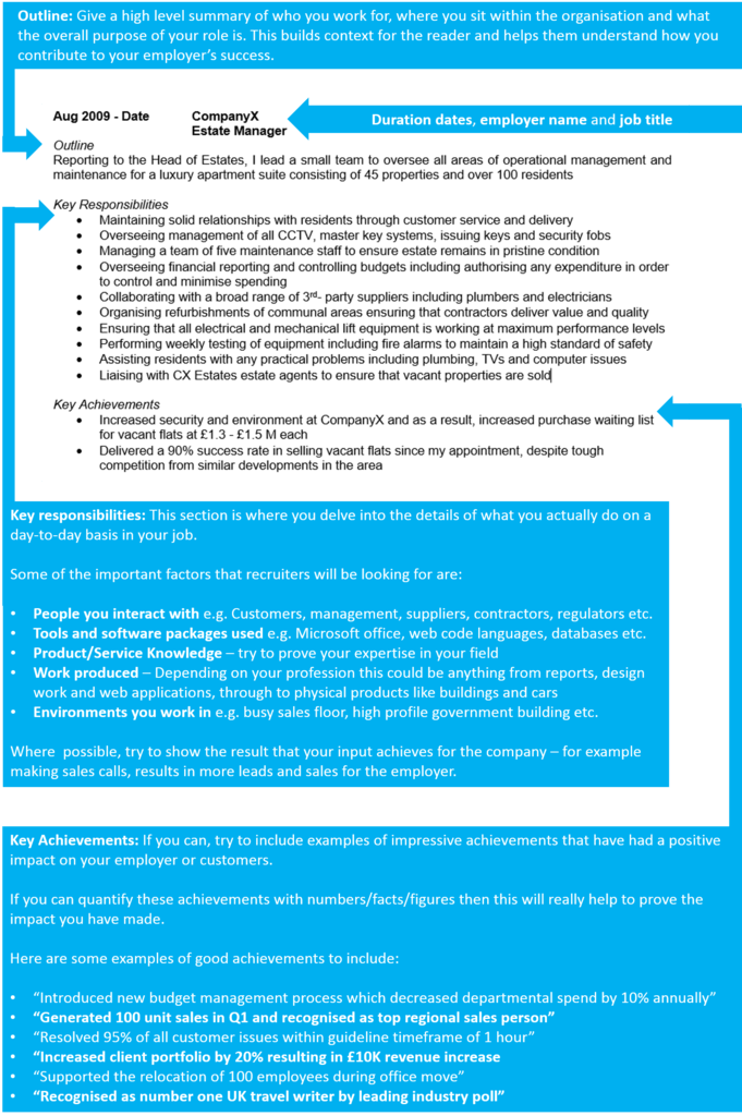
- Structuring Jobs: Break down your jobs into an outline, responsibilities, and achievements to help recruiters quickly understand your roles.
- CV Heading: Place your name and contact information prominently at the top, making it easy for employers to contact you.
- Document: Save your CV as a PDF to ensure the formatting remains consistent across different devices and platforms, and give the document a professional sounding filename.
Font
When creating your CV style, selecting the right font can significantly aid recruiters in reading and understanding your message quickly.
Opt for a professional and easy-to-read font such as Arial, Calibri, or Roboto—essentially, any clean and simple font will work well. These fonts can be found in most modern word processors, such as Google Docs.
Conversely, it’s best to avoid elaborate fonts that could make the CV difficult to read and cause headaches for hiring managers.
Colour Scheme
When selecting a colour scheme for your CV, imagine it as dressing for your first day at a new job: you want to appear sharp, but not too flashy.
Opt for classic dark text on a light background, as this is the most reader-friendly. Black-on-white offers the best readability.
If you want to add a touch of personality, consider using a single additional colour for headings or key lines. A subtle touch of navy, dark green, or maroon can brighten up your CV without overshadowing the main content.
Remember, simplicity is key to professionalism, so don’t overdo it.
Page Margins
Setting the right page margins on your CV can greatly enhance its readability and overall appearance.
A good guideline is to maintain margins of at least 2 cm on all sides. This creates a tidy border around your text, making the content more inviting.
Margins that are too narrow can make your CV look cluttered, while margins that are too wide might decrease the available space for content too much.
CV length
Your CV should ideally be around 2 pages of A4.
In the UK job market, attention spans are brief, so it’s essential to be concise to capture the interest of busy recruiters.
Ensure that all content is relevant and straight to the point—there’s no need to detail every job or duty.
Think of your CV as a showcase of your highlights, not a complete life story.
Split the Page Up
Structuring your CV with clear, logical sections not only enhances its appearance but also guides the reader smoothly through your professional journey.
Divide the document into the following sections:
- Name and contact details
- CV profile
- Core skills list
- Work experience
- Education
- Additional information (optional)
These are the essential areas that employers expect to see.
Typically, these sections should run vertically down the page. However, if you prefer a more modern approach, a two-column layout can be effective. This is especially useful if you want to include a sidebar for quick facts or smaller sections like technical skills or languages. Just ensure that the main content, such as your job experiences, remains the focal point.
Clearly Define Sections
To assist time-strapped recruiters in navigating your CV, use bold or slightly larger fonts for section headings like ‘Work Experience’, ‘Education’, and ‘Core Skills’.
Each section should begin on a new line and be separated by clear spaces from the others, allowing hiring managers to quickly scan and locate the information they need.
This approach increases the likelihood of them recognising your suitability and selecting you for an interview.
Structure jobs logically
When listing your previous roles, begin each entry with your job title, employer, and employment dates, all in bold.
Then, break down each job into the following sections:
Overview: Start with a brief introduction to your role, describing the nature of the company and your position within its organisational structure. This sets the scene for your responsibilities and achievements, helping recruiters grasp the scope and impact of your work.
Primary Responsibilities: Use bullet points to list your main duties and responsibilities. This format makes the information easy to scan and allows you to clearly display the range of skills and expertise you brought to each role. Highlight how your contributions supported the team or furthered the company’s objectives.
Major Achievements: Showcase your key accomplishments, focusing on specific, measurable outcomes. For example, you could say, “Implemented a new customer management system that reduced wait times by 40%.” This shows your ability to deliver results and provides tangible evidence of your impact on the organisation.


Add some modern design features
A decade ago, most career professionals would have recommended keeping your CV plain and simple to maintain a professional appearance and avoid unnecessary complexity.
However, times have changed, and so have CV aesthetics.
While a traditional plain CV design is still perfectly acceptable, there are now many more options available that can not only make your CV more visually appealing but also enhance its functionality by improving readability and highlighting important skills.
Here are some design features to consider:
A splash of colour: Adding some colour to your CV can make it stand out and give it a modern look. Keep it professional by using muted colours like navy blue or dark green, and ensure that the colour scheme does not compromise readability. It is advisable to keep the background white and the body text black to ensure easy reading for all.
A top bar: A coloured bar at the top of the CV can look attractive and professional while providing a prominent place for your contact details.
A side column: Including a slim side column on the left or right of your CV can create a sleek appearance and allow you to highlight important content, such as your core skills and contact details.
Icons: Using icons to denote certain points in your CV can look stylish and save space. For example, icons for your phone number, location, and email address can save space compared to writing them out.
These features can help your CV look more eye-catching while improving its readability and functionality.
Consider adding a photo
Including a photo on your CV isn’t standard practice in the UK, but it can be a great way to breathe some personality into the document and help recruiters to remember that there is a person behind the document,
If you choose to include one, ensure that you look professional in the photo and place it in one of the top corners to save space.
Name the file wisely
When saving your CV, the filename is more significant than you might realise!
Choose a naming format that includes your full name followed by the word ‘CV’. This makes it easily identifiable and looks professional when recruiters or hiring managers download it.
For instance, use ‘JaneDoe_CV.pdf’. And steer clear of vague filenames like ‘CV2023.pdf’ or just ‘CV.pdf’—these can get lost in a sea of similar files, making it harder for employers to locate once they’ve saved your CV to their database.
A handy tip: Use a word processor like Microsoft Word or Google Docs to give your CV a polished appearance.


