If you want to land interviews for the best jobs, your CV layout must be created with recruiters in mind.
The information on your CV needs to be organised and structured in way that will make it easy for them to read the document, and quickly digest the key points.
Here’s the best way to layout your CV to ensure that you get noticed and start lining those interviews up.
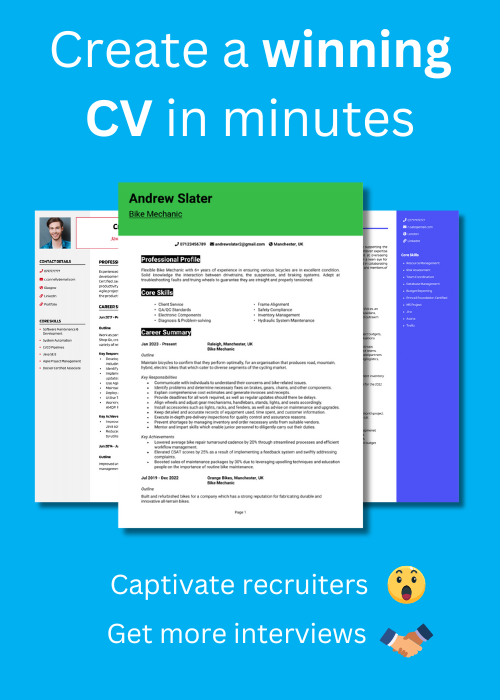
This CV example gives you an overview of how to layout your CV. Check out some effective CV layout variations below.
Traditional CV layout
Key features of a traditional CV layout:
- Colour scheme is very basic using all black text, or maybe a splash of navy blue or grey at most – keeps the CV inoffensive and gives it broad appeal
- CV sections are divided by simple fine borders and capitalised headings, providing a clean professional look and easy navigation for readers.
- Contact details are in bold text, near the top of the CV, so they cannot be missed.
When to use: Suitable for all industries and roles but perfect for applying to traditional firms such as bank or lawyers.
Modern CV layout
Key features of a modern CV layout:
- Big bold colourful bar across the top of the CV gives the document a fresh modern feel and helps it to stand out in a crowded job market.
- Sections are divided using big headings encased in black boxes to make them stand out whilst maintaining a stylish look.
- Plenty of white space across the page makes the CV extremely easy for hiring managers to read.
When to use: Great for applying to modern firms such as Google or Facebook and roles in the digital or IT spaces.


2 column CV layout
Key features of a 2 column CV layout:
- A slim side-column allows for contact details and core skills to be organised neatly, whilst providing a unique professional appearance.
- The addition of a small photo, tucked into the top-left corner, brings the CV to life without taking up too much space.
- Plenty of bullet points, combined with bold borders to define the CV’s sections, make it very easy for recruiters to read.
When to use: A 2 column CV can be used to apply for any role, but will be particularly effective when targeting jobs in creative fields.
How to layout a CV
To layout your CV in a way that will make it stand out to recruiters and highlight your suitability, do the following things:
- Split the page up – Divide the page up clearly into sections by using bold headings and borders, to make it easy for recruiters to navigate.
- Break text up – Within each section, break the text up with bullet points to further improve the reading experience.
- Keep under 2 pages – Recruiters see lots of CVs and don’t spend much time reading each one, so keep it short and impactful to ensure it all gets read.
- Consider adding a photo – Whilst photos aren’t customary in the UK, they can be a great way to add some personality to the document.
- Add some design features – If you want to stand out from the crowd of boring plain black-and-white CVs, try adding some subtle design features, such as coloured bar at the top of the CV.
- Include the following sections – Contact details, CV profile, Core skills section, Work experience, Education, Additional info (optional for things like hobbies and interests)
Split the page up
The first step to a good CV layout is to split the page up into clearly defined sections.
We will discuss what these sections are, further down the guide, but for now we are focusing on how and why you need to split the page up.
When recruiters and hiring managers first open your CV, they are usually pushed for time ; reviewing scores or even hundreds of other CVs. This means that they will initially skim-read the CV to pick out the information they need.
To help them do this, it’s best for the pages to be neatly organised into clearly headed sections, that they recognise and can easily spot.
Think of it like a restaurant menu being divided into Starters, Mains, Desserts and Drinks – the layout makes it much easier for you to find the things you want quickly.
So, before you start writing the content of the CV, think about how you will divide and head each section.
The most effective way to do this is by using big bold headings for each section, with a font-size much larger than the rest of the CV, or by adding a border line between each section. You can even use a combination of both bold headings and border lines.
You should also leave plenty of white space between each section to make the distinction between them even clearer.
Break text up
Another crucial element of structuring your CV is to break up the information inside each section into small bite-sized chunks.
Again, this another way of making the reading experience easier and quicker for recruiters, allowing them to digest the important information about you.
Big unbroken paragraphs are off-putting to people who are trying to read things in a hurry, so keep them out of your CV as much as you can.
Instead, use bullet points throughout your CV (especially in your work experience section) to provide a pleasant and seamless reading experience.
Keep CV under 2 pages
There’s plenty of debate on how long a CV should be, but the truth is there is no formal rule on CV length.
A hiring manager isn’t going to disregard your application just because your CV ran a few sentences longer than they expected it to be.
However, you have to once again, bear in mind the attention spans in modern recruitment.
With most recruiters reviewing hundreds of CVs every week, it’s unlikely that they will read a CV in full, if it is 3 pages or over (on their first review anyway).
In my experience as a recruiter, I would advise keeping your CV to around 2 pages. In most cases this gives you enough space to get your message across, without overwhelming or boring the reader.
However, if you have lots of experience, or work in a formal field like academia – and you find yourself spilling onto the third page, don’t panic – it’s probably not going to have a negative effect on your applications.
Conversely, if you don’t have much experience, and you really feel that you’ve included all of your important attributes on one page, don’t feel that you have to fill a second page just to hit an arbitrary CV length target.
So, try your best to keep your CV at around 2 pages, but don’t worry if it’s a little shorter or longer.
Consider adding a photograph
Whist adding a photograph to your CV might not be considered “the norm” in the UK – it is starting to become more popular, and does have some benefits.
Though important, the CV can sometimes be a fairly boring document. Adding a photo can breathe some life and personality into it, and remind recruiters that there is a real person behind the PDF -helping you to create a connection with them.
If you want to add one. Just make sure that the image doesn’t take up too much valuable space on the page. Ideally you should keep it small and tucked up into one of the top corners.
Also, it’s vital that you look professional in the photograph, so get a friend to take a headshot photo of you, whilst wearing the type of clothing you would normally wear to work, and look straight at the camera. Don’t use a selfie or a cropped photo from a night out with friends – they will not make a great impression for the CV and could put recruiters off.


Add some professional design features
10 years ago, most careers professionals would have advised you to keep your CV as plain and simple as possible – to maintain a professional outlook and avoid overcomplicating things.
But times change, and so have CV aesthetics.
Whilst you can absolutely still use a plain traditional CV design, there are many more options available nowadays, that can not only help your CV to look more eye-catching, but also improve it’s functionality by aiding the readability or allowing you to highlight important skills.
Some good design features to consider are:
- A splash of colour – Adding some colour to your CV can help it to stand out and create a modern look. Keep it professional by sticking to muted colours (like navy blue or dark green) and ensure that the colour scheme does not negatively affect the readability of the CV. Note that I would always recommend keeping the background white and body text black to ensure the CV can easily be read by all.
- A top bar – A coloured bar at the top of the CV can look attractive, professional, and allow you to contain your contact details in an easy-to-spot location.
- A side column – Adding a slim side column to the left or right of your CV can create a sleek appearance and allow you to draw attention to important content, such as your core skills and contact details.
- Icons – Adding some icons to denote certain points in your CV can look great and also save space. For example, using icons to identify your “phone number”, “location” and “email address” will save you some space when compared to typing them all on the CV.
Include the following sections in your CV
Once you have your CV formatting sorted, add the following sections to it, to give recruiters exactly what they want.
Name & contact details
Start off your CV with your name and a basic list of your contact details at the top so that recruiters can contact you easily.
In modern CV formats these can go into the top bar, or the top of a side-column.
Here’s what you should include:
- Mobile number
- Email address – It’s often helpful to create a new email address, specifically for your job applications.
- Location – Share your town or city ; there’s no need for a full address.
- LinkedIn profile or portfolio URL – Make sure the information on them is coherent with your CV, and that they’re up-to-date and impressive.
Quick tip: Delete excessive details, such as your date of birth or marital status. Recruiters don’t need to know this much personal data about you, so it’s best to save the space for your other CV sections.
CV Profile
Make a strong first impression on employers by heading your CV with an impactful profile (also known as a personal statement).
This short introduction paragraph should summarise your skills, experience, and knowledge ; whilst highlighting your suitability for the jobs you are targeting.
It should be compelling enough to encourage recruiters to read through the rest of your CV, so don’t be afraid to sell yourself.
You can see some example CV profiles here.
Core skills section
Create a core skills section underneath your profile to draw attention to your most in-demand skills and get recruiters attention quickly.
This section should feature 2 columns of bullet points that emphasise your applicable skills for your target jobs.
Before writing this section, review the job description and compile a list of any specific skills, specialisms, or knowledge required – then try to reflect them as closely as possible here.
Work experience
Now it’s time to list your work experience, which should make up the bulk of your CV.
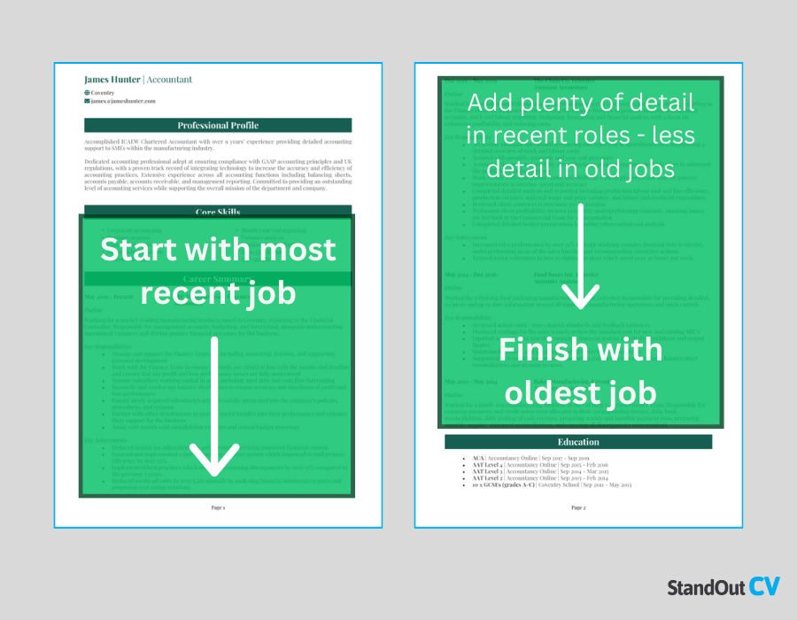
Begin with your current (or most recent) job, and work your way backwards.
If you’ve got too much experience to fit onto two pages, prioritise space for your most recent and relevant roles.
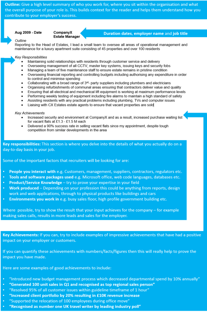
You should structure each job on your CV like the example below. This allows for easy navigation and reading.
Education
Towards the bottom of your CV, add an education section.
This should simply be a list of your recent and relevant qualifications in relation to your target jobs.
If you’re experienced – keep it brief. If you don’t have much work experience, then compensate by adding plenty of detail here.
Additional info (optional)
At the end of your CV, you can consider adding a section for additional information, but this is completely optional.
This part is suitable for hobbies, interests, awards, publications, travel or technical skills that could enhance your appeal to employers.
When adding content here, ensure it is either directly relevant to your profession (like a hobby that is related to your job) or exceptionally impressive.
Avoid listing everyday activities like watching television or casual socialising, as they are unlikely to influence hiring decisions.


