


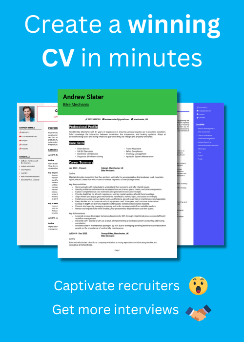
Font choice might not sound like the most exciting part of writing a CV – but it’s important.
Trust me – I’ve seen plenty of great applications let down by messy, hard-to-read formatting.
The right font makes your CV easy on the eye and allows recruiters and employers to quickly scan through your skills and experience without distraction.
I’ll show you the 10 best fonts for a CV, along with a few formatting tips that will help your application look sharp and professional.
Best fonts for your CV
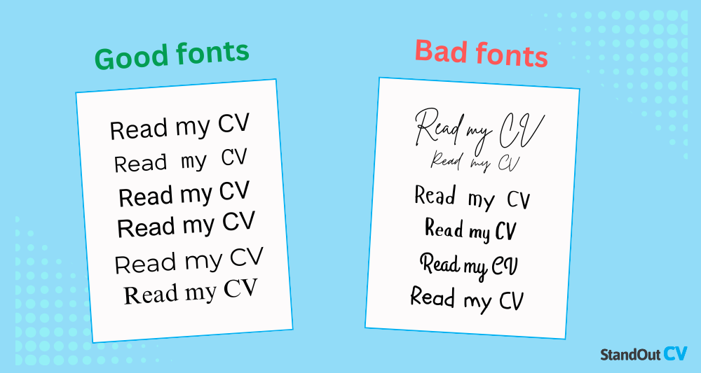
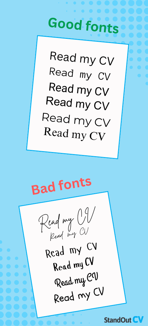
Here are the top 10 best fonts for your CV with previews of how they’ll look, and what makes them work.
- Roboto – Modern and clean, with excellent readability.
- Arial – Simple, professional, and easy to read.
- EB Garamond – Elegant and timeless, adding sophistication.
- Courier Prime – Retro and clear, with a distinctive style.
- Source Code Pro – Monospaced and precise, ensuring clarity.
- Montserrat – Stylish and modern, with a geometric design.
- Times News Roman – Traditional and polished, highly professional.
- Calibri – Neat and versatile, perfect for any context.
- Helvetica – Sleek and minimalistic, universally recognised.
- Cambria – Clean and refined, offering a balanced appearance.
Roboto
This popular font, used by companies from Google to the United Nations, is a simple but stylish typeface, known for its ease of reading.

⭐ Best for: Writing and communication roles
Arial
It’s easy to see why Arial remains among the most popular fonts; it’s a clean font which is well-suited for all industries and careers.
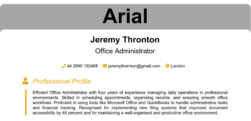
⭐ Best for: Administrative CVs
EB Garamond
This elegant font is the ideal way to add a touch of class to your CV without ruining the recruiters’ reading experience.
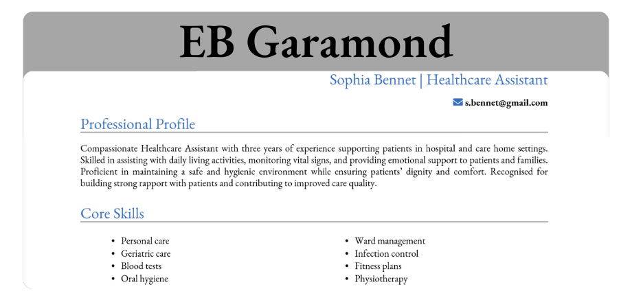
⭐ Best for: Healthcare CVs
Courier Prime
A traditional look without appearing dated or unprofessional, instead prioritising readability.
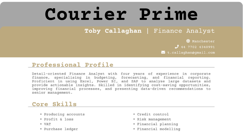
⭐ Best for: Finance and business CVs
Source Code Pro
Any computing role would suit this font – it was created specifically for coding environments.

⭐ Best for: Programming and IT CVs
Montserrat
Here’s another versatile font, commonly seen in websites and branding due to its modern and readable style.
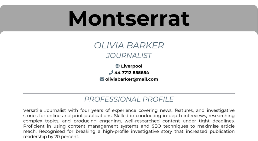
⭐ Best for: Admin and journalism
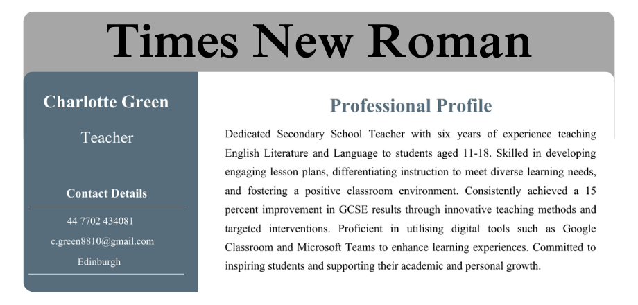
Times New Roman
Calibri
There’s a reason why Calibri has become the go-to for many modern word processors. It’s a sleek and readable choice that’ll suit all CVs.
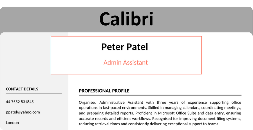
⭐ Best for: Most jobs and industries
Helvetica
This timeless classic is a popular choice, owing to its structured and readable look.
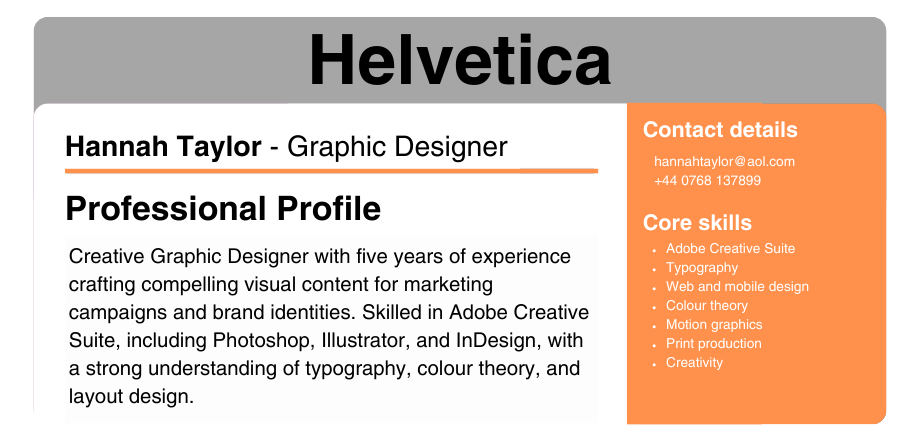
⭐ Best for: Designers and creative CVs
Cambria
Cambria brings out the traditional, formal look of Times New Roman, and adds a touch of modernism.
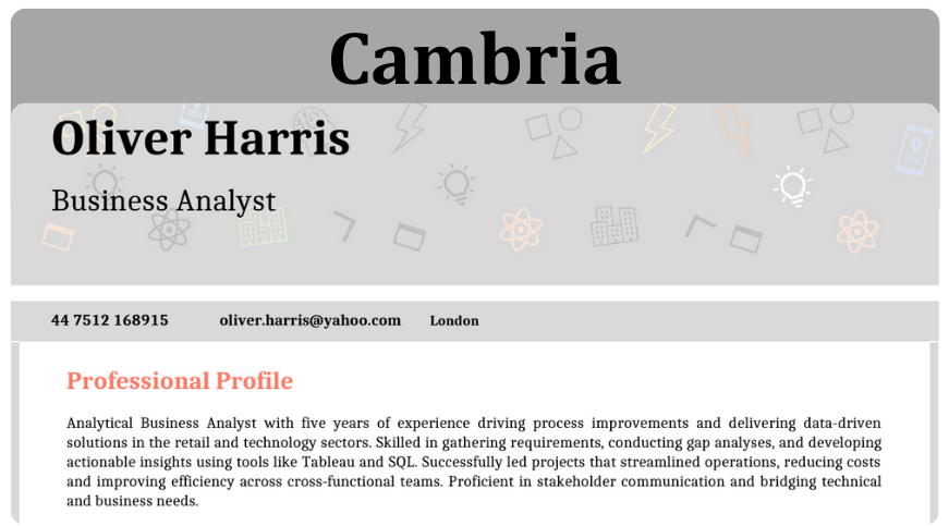
⭐ Best for: Business analyst and project manager CVs

Does font matter on a CV?
Yes, the font you use on your CV matters greatly.
A good choice of CV font will make your CV appear professional and ensure it is easy for busy recruiters to read and digest the information – both important factors in landing job interviews.
A font which is suited for the jobs and industry you’re applying for will also help convey how well-suited you are for the role.
What font size should my CV use?
The font you use in a CV should be between size 10 to 13, to allow easy readability and keep your CV to a digestible length.
Any larger, and your CV might start to look unprofessional and fail to fit onto the ideal length of 2 pages, and smaller sizes will be a struggle for recruiters to read.
Again, formatting your CV is all about making the reading experience as easy and pleasant as possible.
There’s one exception though… The headers for each section of your CV should be slightly larger in order to stand out and guide recruiters along each part of your application. You should also make them bold and a different colour to the body text, to really make them pop.
Not sure which font makes your CV look professional?
Try our CV builder—it offers expertly designed templates with optimized fonts and formatting, ensuring your CV is both stylish and easy to read.
4 CV formatting tips
Picking the right font for your CV is essential, but there’s a lot more to formatting your CV.
Following these tips will help ensure your application is as polished and professional as it can be to impress recruiters.
Choose the right font colour
Black text on a white background might seem boring, but it works, because it guarantees maximum readability.
Following this common template ensures your CV is clear, easy to read, and works well both in print and on screen.
You might consider using a second, subtle colour for headings or section titles to make your CV visually engaging. Stick to neutral tones like dark grey, navy, or muted colours – anything too bright or flashy (neon green, for instance) can undermine the polished look of your CV.
Avoid including more than one additional colour, as it can make your CV look messy or unprofessional, and recruiters may struggle to take you seriously.
Make sure it’s ATS-compatible
Applicant Tracking Systems (ATS) are used by recruiters to scan and filter CVs, so ensuring your CV is ATS-friendly is vital to getting noticed. Fonts with clean, simple lines are easier for an ATS to read, helping your CV pass this crucial stage.
Avoid decorative or overly complex fonts that might confuse the system and result in your CV being discarded before it even reaches a recruiter.
Use bullet points
Readability isn’t just about fonts; structuring your CV in a way that’s easy to scan is equally important. Bullet points are a fantastic way to break up large blocks of text and draw attention to key details about your skills, achievements, and work experience.
For example, in your work experience section, use bullet points to list specific responsibilities and achievements, keeping each point concise and impactful.
This approach helps recruiters to skim through with ease and readily pick out the important pieces of content, without being overwhelmed by sheer quantity.

Make it a PDF
Sending your CV as a Google Docs or Word document might seem harmless, but there’s always a risk that recruiters won’t have the same fonts installed on their system. If your CV opens with missing fonts or skewed formatting, it could leave a poor impression.
Exporting your CV as a PDF ensures that your font, layout, and structure remain intact, no matter what device or software the recruiter uses to open it. PDFs are also more professional-looking and less prone to accidental edits, so you’ll avoid any potential formatting mishaps.
Worst fonts for a CV
Here are some fonts to avoid if you want to ensure your CV doesn’t look unprofessional or a difficult to read.
- Comic Sans – This one is just too casual and playful. It gives off an unprofessional vibe, making it unsuitable for any job application.
- Impact – Bold and attention-grabbing, but far too heavy for body text, Impact comes across as shouty and difficult to read.
- Courier – This typewriter-style font feels outdated and lacks the polish and professionalism needed for a CV.
- Bradley Hand – Its handwritten style might seem personable, but Bradley Hand appears unpolished and informal, undermining your professionalism.
