There are a number of reasons why you might want to add color to your resume.
A splash of color can make it more visually appealing, or help to highlight important facts.
But which color should you choose?
According to color psychology, different colors can evoke different emotions in people, so it’s vital to pick a color that will give recruiters the right first impression of you.
In the guide below, we’re going to take a look at the benefits of adding color to your resume, along with which colors will help you get hired.
Best colors to use on a resume
Are you bored with the classic black and white application?
Then perhaps you should think about adding a pop of color to your resume.
The tricky part is deciding which color is going to be the most effective for you.
Here are some of the best colors, the emotions and ideas they project, and the industries they are most suitable for.
Blue

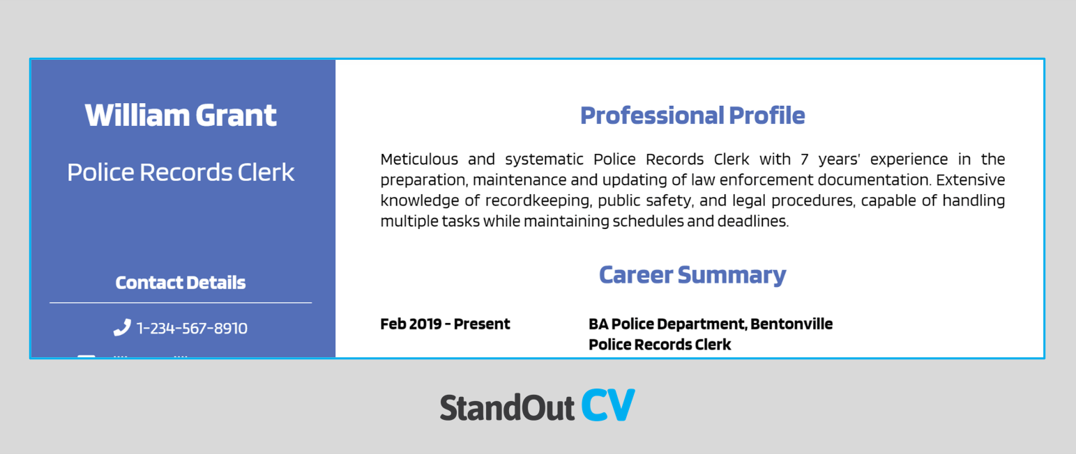
Blue has a number of connotations that are useful in a professional setting, such as honesty, trust, and responsibility. Plus, it can help to grab the reader’s attention and break up content without being too distracting.
This is why blue is often considered the best color to use on a resume after black and white and is ideal for roles that require a confident but calm demeanor, like nursing, sales, finance, or senior positions.
Red

Red is often used to symbolize power, passion, and action, which are all great qualities in an employee. This makes red a good color for your resume.
That being said, brighter tones can be distracting or evoke more negative feelings, so we suggest sticking with deeper red hues like burgundy or maroon. This color suits roles like marketing, design, and web development.
Orange

In color psychology, orange is used to symbolize strength, productivity, and tenacity. This makes it ideal for project managers, creative roles, and managerial positions. Plus, there is a whole spectrum of orange colors, from peach to brass, so you have plenty to choose from to find the perfect color for your application.

Yellow

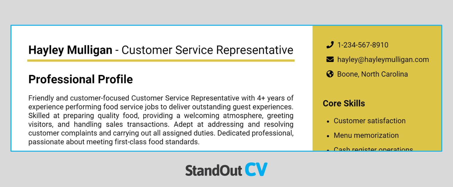
We often associate the color yellow with positivity and happiness; this makes it the ideal color if you’re a teacher, a customer service rep, or you work in accommodation or food services.
Not only this, but it symbolizes energy and creativity, which can be ideal for creative roles like graphic designers, as well as those in leadership positions.
Green

Green has two key associations, the first being nature and the environment, the other being wealth and tradition. It is also a tranquil and fresh color.
For all of these reasons, green shades are better for more traditional industries like agriculture, manufacturing, and engineering. These industries also lend themselves nicely to blue shades as well.
Sidenote: we recommend sticking to deeper green shades rather than brighter tones like lime, to ensure it contrasts from the white page.
Purple

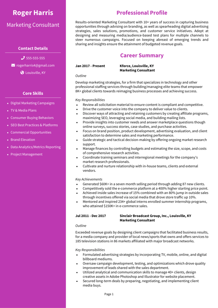
Many are surprised by the suggestion to use the color purple, but this can be a great way to stand out in a saturated market. Purple is often associated with luxury, power, and ambition, as well as extravagance and creativity.
Because of this, we suggest using purple for positions in industries like fashion, retail, design, photography, and other creative roles.
Gold

The color gold might seem an odd choice for a resume, but it is reminiscent of success, and achievement. So in a way, it’s ideal for a job application if you want to denote power and sophistication.
This can be great for a minimalist style resume or paired with colors like black, purple, and green. This is ideal for goldsmiths or jewelers, executives, administrators, and finance positions.
Grey

Grey often represents neutrality and balance. It is also a color we associate with professionalism, which is good for representing psychologists, sales, product management, accounting, and advisory roles.
Just be careful that light grey tones on a white background don’t make it too hard to read the text. To combat this, it’s better to stick to darker grey tones.
Black and white

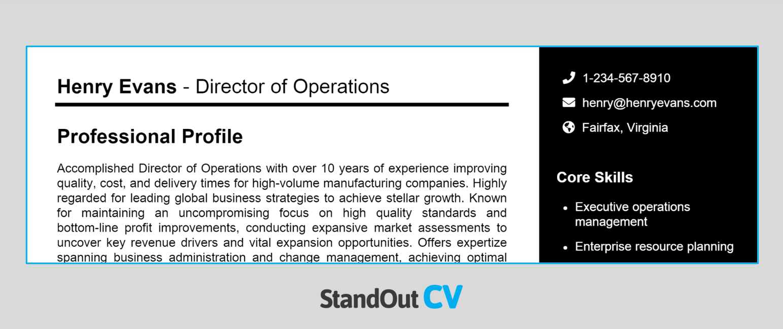
Black and white is the classic; it’s how we typically understand resumes. Keeping this traditional color scheme can make things simpler and make it much easier to read without creating any distractions for the recruiter. It is also one of the most professional styles.
With this in mind, black and white are ideal for roles like those in finance, IT, legal, and banking.
The benefits of using color in your resume
As we’ve said, there are several reasons why you should consider adding color to your resume if you haven’t already. Some of the key benefits include:
- Getting recruiter’s attention – As colors, particularly bolder colors, draw the eye, you can grab the recruiter’s attention and increase your chances of standing out from the competition
- Proving creative skills – When applying for roles that require an element of creativity or creative thinking, adding a pop of color is the ideal way to demonstrate these skills
- Making your resume easy to read – If you choose colors that contrast nicely with one another, this can make it easier to read. Similarly, using color on the headings can improve the structure of your resume and make the format easier for the recruiter to scan through and quickly find the information they’re looking for
Where to use color in your resume
Using color on your resume can be beneficial, but only if you do it correctly. Get this wrong, and you could find your application is quickly dismissed. Here’s how to use color as effectively as possible.
Section headings
One of the most popular ways to use color on your resume is in the headings and subheadings of your different sections. You may wish to use slightly different tones for headings and subheadings, but you don’t have to.
By using colors in this way, you can make the structure of your content clear and quickly draw the recruiter’s eye to the relevant sections and information.
Side and top bars

Adding a top or sidebar to your resume can instantly make the document feel and look different. Colorful sidebars can be used to make your resume more unique and are a helpful way to divide and highlight key information. A top bar can add some color to the document whilst drawing attention to your name, job title, and contact details.
What color should the body text be in your resume?
Although you may choose to add color to certain aspects of your resume, it’s best that the body of your text should remain simple. This should always be black text on a white background, as this is traditional and professional and makes it easier for the recruiter to read.
Should you use color in your resume?
As we’ve shown, there are several benefits to using color on your resume to land interviews, though this will depend on how it is used and the types of jobs you’re applying to.
The ultimate goal is to create a resume that is professional and easy to read, and though color can play a part in this, you need to be careful and selective about how you use it.
If you want to be a bit more creative and stand out, add a splash of color. But if in doubt, it’s best to stick to black and white or use more neutral tones like grey and blue.